biostats.count_plot#
- biostats.count_plot(data, x, color=None)[source]#
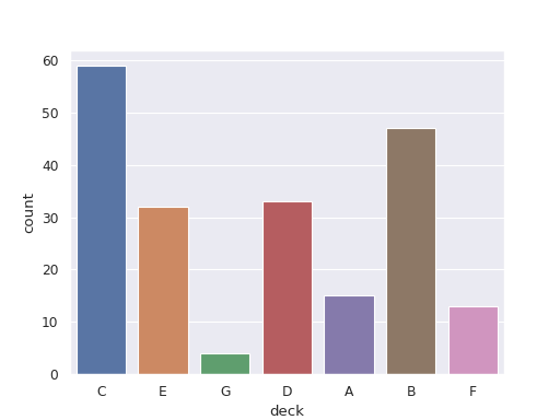
Draw a bar plot to show the counts of groups in a categorical variable.
- Parameters:
- data
pandas.DataFrame The input data. Must contain at least one categorical column.
- x
str The categorical variable to be plotted. Maximum 20 groups.
- color
str The categorical variable specifying groups to be plotted with different colors. Maximum 20 groups. Optional.
- data
- Returns:
- fig
matplotlib.figure.Figure The generated plot.
- fig
See also
bar_plotDraw a bar plot to show the difference between groups in a categorical variable.
Examples
>>> import biostats as bs
>>> import matplotlib.pyplot as plt
>>> data = bs.dataset("titanic.csv")
>>> data
     survived  pclass     sex   age  sibsp  parch     fare embarked   class    who adult_male deck  embark_town alive  alone
0           0       3    male  22.0      1      0   7.2500        S   Third    man       True  NaN  Southampton    no  False
1           1       1  female  38.0      1      0  71.2833        C   First  woman      False    C    Cherbourg   yes  False
2           1       3  female  26.0      0      0   7.9250        S   Third  woman      False  NaN  Southampton   yes   True
3           1       1  female  35.0      1      0  53.1000        S   First  woman      False    C  Southampton   yes  False
4           0       3    male  35.0      0      0   8.0500        S   Third    man       True  NaN  Southampton    no   True
..        ...     ...     ...   ...    ...    ...      ...      ...     ...    ...        ...  ...          ...   ...    ...
886         0       2    male  27.0      0      0  13.0000        S  Second    man       True  NaN  Southampton    no   True
887         1       1  female  19.0      0      0  30.0000        S   First  woman      False    B  Southampton   yes   True
888         0       3  female   NaN      1      2  23.4500        S   Third  woman      False  NaN  Southampton    no  False
889         1       1    male  26.0      0      0  30.0000        C   First    man       True    C    Cherbourg   yes   True
890         0       3    male  32.0      0      0   7.7500        Q   Third    man       True  NaN   Queenstown    no   True
We want to visualize the counts of different deck.
>>> fig = bs.count_plot(data=data, x="deck")
>>> plt.show()
