biostats.strip_plot#
- biostats.strip_plot(data, x, y, color=None)[source]#
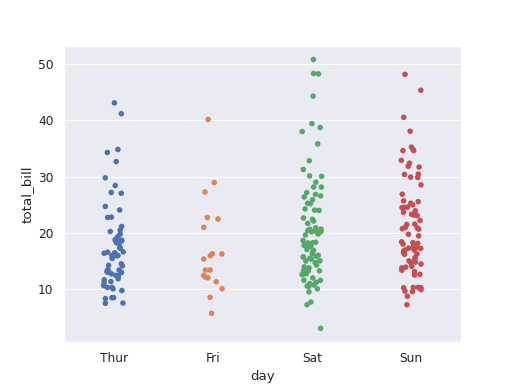
Draw a strip plot to show the difference between groups in a categorical variable.
- Parameters:
- data
pandas.DataFrame The input data. Must contain at least one numeric column and one categorical column.
- x
str The categorical variable to be plotted in x-axis. Maximum 20 groups.
- y
str The numeric variable to be plotted in y-axis.
- color
str The categorical variable specifying groups to be plotted with different colors. Maximum 20 groups. Optional.
- data
- Returns:
- fig
matplotlib.figure.Figure The generated plot.
- fig
See also
swarm_plotDraw a swarm plot to show the difference between groups in a categorical variable.
box_plotDraw a box plot to show the difference between groups in a categorical variable.
Examples
>>> import biostats as bs
>>> import matplotlib.pyplot as plt
>>> data = bs.dataset("tips.csv")
>>> data
     total_bill   tip     sex smoker   day    time  size
0         16.99  1.01  Female     No   Sun  Dinner     2
1         10.34  1.66    Male     No   Sun  Dinner     3
2         21.01  3.50    Male     No   Sun  Dinner     3
3         23.68  3.31    Male     No   Sun  Dinner     2
4         24.59  3.61  Female     No   Sun  Dinner     4
..          ...   ...     ...    ...   ...     ...   ...
239       29.03  5.92    Male     No   Sat  Dinner     3
240       27.18  2.00  Female    Yes   Sat  Dinner     2
241       22.67  2.00    Male    Yes   Sat  Dinner     2
242       17.82  1.75    Male     No   Sat  Dinner     2
243       18.78  3.00  Female     No  Thur  Dinner     2
We want to visualize the difference of total_bill between groups in day.
>>> fig = bs.strip_plot(data=data, x="day", y="total_bill")
>>> plt.show()
