biostats.fa_plot#
- biostats.fa_plot(data, x, factors, color=None)[source]#
Perform a factor analysis and draw a scatter plot to show the transformed data.
- Parameters:
- data
pandas.DataFrame The input data. Must contain at least two numeric columns.
- x
list The list of numeric variables to be analyzed.
- factors
int The number of factors.
- color
str The categorical variable specifying groups to be plotted with different colors. Maximum 20 groups. Optional.
- data
- Returns:
- fig
matplotlib.figure.Figure The generated plot.
- fig
See also
pca_plotPerform a principle component analysis and draw a scatter plot to show the transformed data.
lda_plotPerform a linear discriminant analysis and draw a scatter plot to show the transformed data.
factor_analysisFind the underlying factors of a set of variables.
Examples
>>> import biostats as bs
>>> import matplotlib.pyplot as plt
>>> data = bs.dataset("iris.csv")
>>> data
     sepal_length  sepal_width  petal_length  petal_width    species
0             5.1          3.5           1.4          0.2     setosa
1             4.9          3.0           1.4          0.2     setosa
2             4.7          3.2           1.3          0.2     setosa
3             4.6          3.1           1.5          0.2     setosa
4             5.0          3.6           1.4          0.2     setosa
..            ...          ...           ...          ...        ...
145           6.7          3.0           5.2          2.3  virginica
146           6.3          2.5           5.0          1.9  virginica
147           6.5          3.0           5.2          2.0  virginica
148           6.2          3.4           5.4          2.3  virginica
149           5.9          3.0           5.1          1.8  virginica
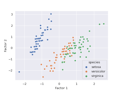
We want to perform a factor analysis and visualize the transformed data.
>>> fig = bs.fa_plot(data=data, x=["sepal_length", "sepal_width", "petal_length" ,"petal_width"], factors=2, color="species")
>>> plt.show()