biostats.density_plot#
- biostats.density_plot(data, x, smooth, color=None)[source]#
Draw a density curve to show the distribution of a numeric variable.
- Parameters:
- data
pandas.DataFrame The input data. Must contain at least one numeric column.
- x
str The numeric variable to be plotted.
- smooth
floatorint The smoothing of the curve. Larger value with smoother curve.
- color
str The categorical variable specifying groups to be plotted with different colors. Maximum 20 groups. Optional.
- data
- Returns:
- fig
matplotlib.figure.Figure The generated plot.
- fig
See also
histogramShow the distribution by a histogram.
density_plot_2DDraw a 2 dimensional density plot from 2 numeric columns.
Examples
>>> import biostats as bs
>>> import matplotlib.pyplot as plt
>>> data = bs.dataset("penguins.csv")
>>> data
    species     island  bill_length_mm  bill_depth_mm  flipper_length_mm  body_mass_g     sex
0    Adelie  Torgersen            39.1           18.7                181         3750    MALE
1    Adelie  Torgersen            39.5           17.4                186         3800  FEMALE
2    Adelie  Torgersen            40.3           18.0                195         3250  FEMALE
3    Adelie  Torgersen             NaN            NaN               <NA>         <NA>     NaN
4    Adelie  Torgersen            36.7           19.3                193         3450  FEMALE
..      ...        ...             ...            ...                ...          ...     ...
339  Gentoo     Biscoe             NaN            NaN               <NA>         <NA>     NaN
340  Gentoo     Biscoe            46.8           14.3                215         4850  FEMALE
341  Gentoo     Biscoe            50.4           15.7                222         5750    MALE
342  Gentoo     Biscoe            45.2           14.8                212         5200  FEMALE
343  Gentoo     Biscoe            49.9           16.1                213         5400    MALE
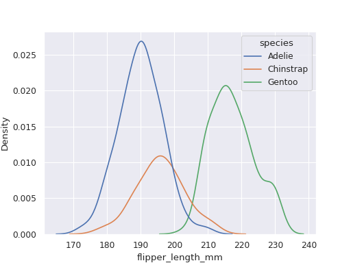
We want to visualize the distribution of flipper_length_mm in different species.
>>> fig = bs.density_plot(data=data, x="flipper_length_mm", smooth=1, color="species")
>>> plt.show()
