biostats.line_plot#
- biostats.line_plot(data, x, y, color=None)[source]#
Draw a line plot to show the relation between two numeric variables.
- Parameters:
- data
pandas.DataFrame The input data. Must contain at least two numeric columns.
- x
str The numeric variable to be plotted in x-axis.
- y
str The numeric variable to be plotted in y-axis.
- color
str The categorical variable specifying groups to be plotted with different colors. Maximum 20 groups. Optional.
- data
- Returns:
- fig
matplotlib.figure.Figure The generated plot.
- fig
See also
scatter_plotDraw a scatter plot to show the relation between two numeric variables.
regression_plotDraw a regression line to show the relation between two numeric variables.
Examples
>>> import biostats as bs
>>> import matplotlib.pyplot as plt
>>> data = bs.dataset("flights.csv")
>>> data
     year      month  passengers
0    1949    January         112
1    1949   February         118
2    1949      March         132
3    1949      April         129
4    1949        May         121
..    ...        ...         ...
139  1960     August         606
140  1960  September         508
141  1960    October         461
142  1960   November         390
143  1960   December         432
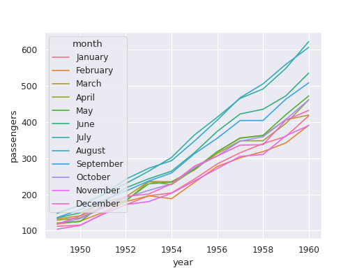
We want to visualize the relation between year and passengers.
>>> fig = bs.line_plot(data=data, x="year", y="passengers", color="month")
>>> plt.show()